How to Blend Data in Looker Studio (Explained 2026)
Are you confused about how to blend data in Looker Studio? This guide is the tutorial you need to understand data blending in Looker Studio.
Data blending in Looker Studio (formerly known as Google Data Studio) is a vital concept that enables you to look beyond a single data source, transforming a basic report into a complete analysis.
In this guide, I will provide a clear step-by-step tutorial on how to blend data in Looker Studio, also ensuring you can unify your insights from separate sources like Google Analytics, Google Ads, and custom spreadsheets.
Looker Studio Data Blending (TOC):
What is Data Blending in Looker Studio?
Data blending in Looker Studio is the process of combining information from different data sources into a single detailed report. You can blend this data in the form of tables, charts, and other visual displays.
Looker Studio allows you to blend data from different sources, i.e, Google Analytics 4, Google Search Console, and Google Ads. In addition to Google’s native products, Looker Studio also supports third-party data sources such as Facebook Ads, LinkedIn, Shopify, HubSpot, and Salesforce.
Looker Studio offers a range of features that make data blending both insightful and user-friendly. These tools help you consolidate all your marketing and sales data into a single dashboard.
So, instead of switching between multiple dashboards, Looker Studio’s data blending feature allows you to view all your metrics in one place. Although traditional data analysis makes use of technical database-related methods, data blending in Looker Studio is much simpler.
It makes use of temporary links of existing data sources based on a shared field, known as a join key. This makes blending more flexible and easier to manage.
How Does Data Blending Work in Looker Studio?
The blending process in Looker Studio relies on identifying one or more common fields, known as Join Keys, between the datasets. Here is a simplified view of how to blend data in Looker Studio:
- Data Request: A user loads a chart requesting data from a blended source.
- Key Identification: Looker Studio identifies the selected Join Keys (e.g., ‘Date’ and ‘Campaign’).
- Data Fetch: Looker Studio sends simultaneous requests to the underlying data connectors (e.g., Google Analytics and Google Ads).
- Matching (The Join): The data from both sources is matched row-by-row based on the values in the Join Keys, according to the specified Data Blend Type.
- Collection is assembled: Metrics are aggregated, and the combined result is displayed in the chart.
Types of Data Blending in Looker Studio
The data blend types of Looker, often referred to as a “Join,” determine how unmatched rows are handled. Therefore, it is crucial to select the correct join type, as this is a key step in ensuring accurate reports on how to blend data in Looker Studio.
1. Inner Data Blending (Inner Join)
An Inner data blend invalid looker Join returns only the rows where the Join Key value exists in all of the blended tables.
For instance, when you only care about website sessions that also resulted from a paid ad click. You would blend Google Analytics sessions with Google Ads clicks, joined by ‘Date’ and ‘Campaign ID.’
2. Left Outer Join
A Left Outer Join returns all rows from the Left table and the matched rows from the Right table. If a row in the Left table has no match in the Right, the metrics from the Right table will show as null or 0. This is the most common and generally safest joint type.
It’s perfect for viewing all your Google Analytics data (Left table) and adding the Google Ads cost (Right table) where available. If a date had traffic but no ads running, that date still appears, but the cost metric is zero.
3. Right Outer Join
A Right Outer Join is the reverse of a Left Outer Join. It returns all rows from the Right table and the matched rows from the Left table. However, it is less common, but useful when you are focused on the Right table.
If you are looking to blend a list of all planned campaigns from a spreadsheet (Right) with actual performance from Google Analytics (Left). This allows you to identify planned campaigns that generated zero actual performance data.
How to Set Up Data Blending in Looker Studio (Step by Step)
The process for how to blend data in Looker Studio is formed directly from the report editor screen. You don’t need to create a blend before building a chart; instead, you make it as you build the chart. To set up your charts for blending data from Google Spreadsheets in Looker, here are the steps you can follow for Looker Studio Blend data:
Step 1: Select the Initial Component
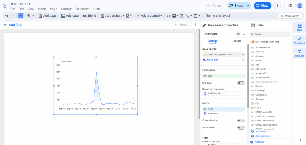
- Start by adding a chart (e.g., a Time Series chart or a Table) to your report canvas.
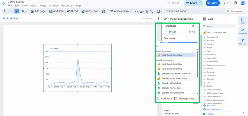
- Then in the chart’s Setup panel, select your first data source.
Note: Looker Studio also asks for the data source before you start building the report, so if you chose that option, you don’t have to add the first data source again here.
Step 2: Initiate the Blend
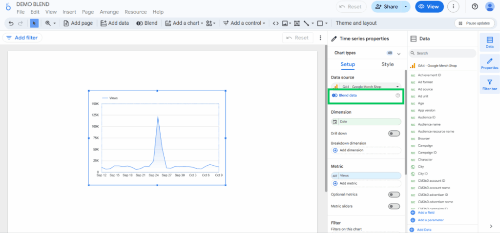
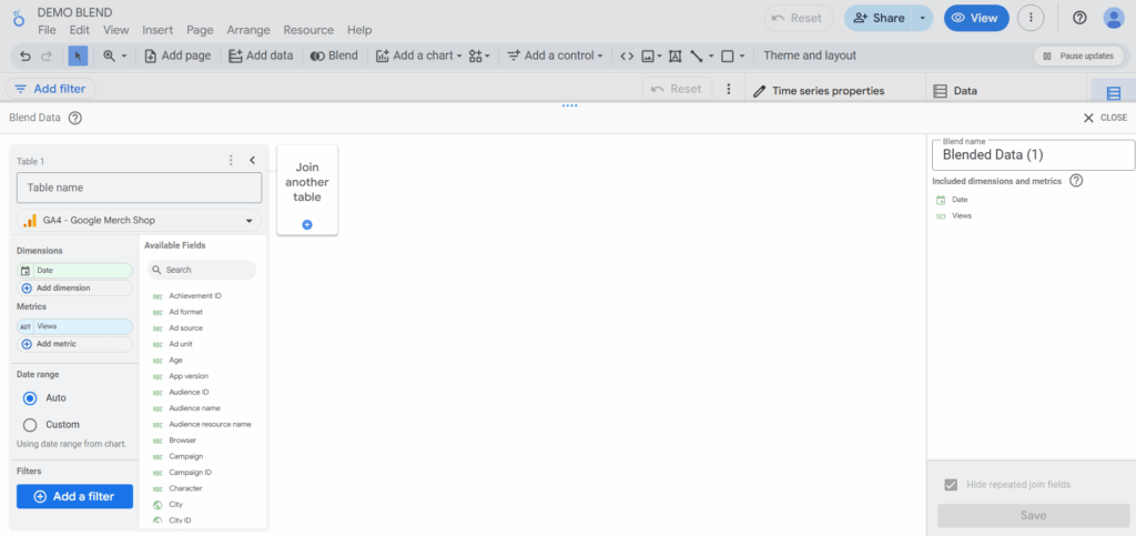
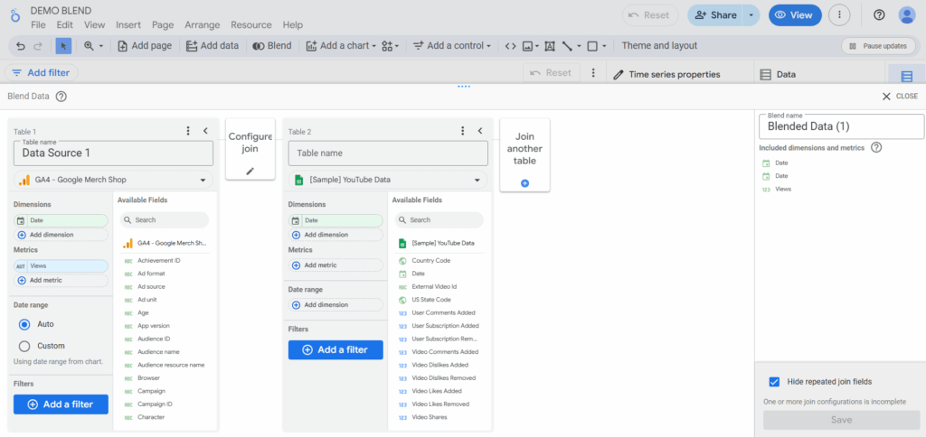
In the Setup panel of the chart, locate the Data Source box and click the Blend data button to learn how to blend data in Looker Studio.
This will open the Configure data blend panel.
Step 3: Add and Configure the Second Data Source
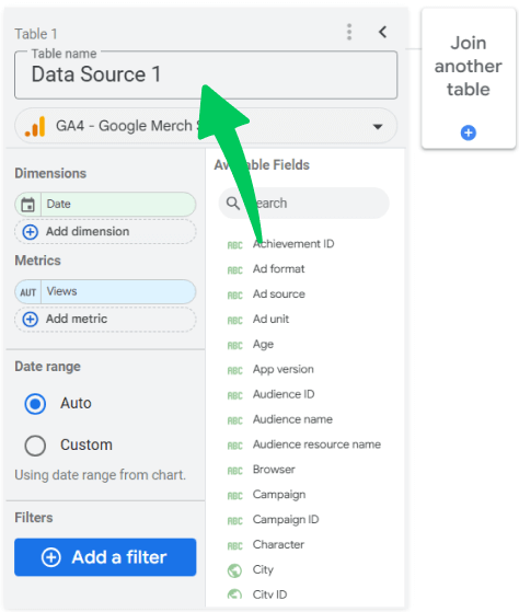
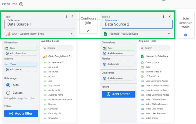
Once the configuration panel opens, you can tell that the first source (Table 1) will be pre-filled. For better understanding, I will rename the first table as Data Source 1 for this tutorial on how to blend data in Looker Studio.
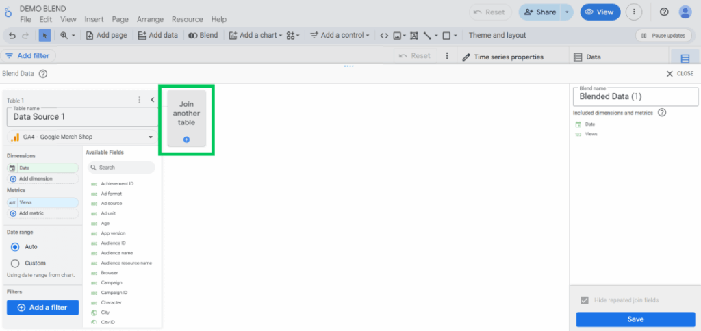
Now you will click Add another data source (Table 2). So, click on Join another table to add the second data source.
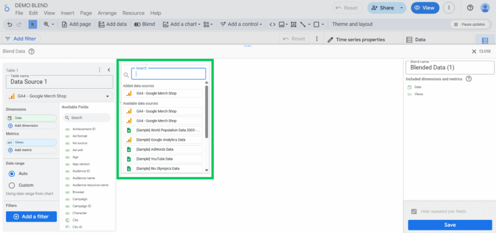
Select your preferred second data source.
I will be choosing a sample of YouTube data for my blend. You can repeat this process to add up to any number of sources in one blend.
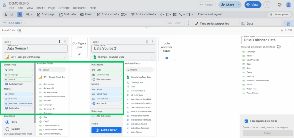
Tip: Name your tables self-explanatory names so they won’t get mixed up. Check the following screenshot for more understanding.
Step 4: Define the Join Keys (The Match Field)
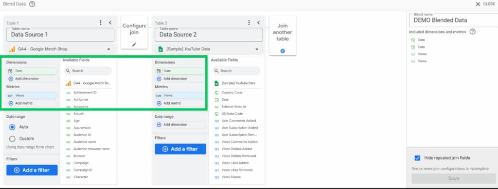
For Table 1 and Table 2, select the fields that should match records. These are your Join Keys. Just like in the screenshot, both metrics and dimensions are matched.
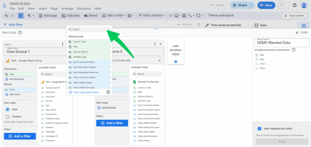
Click the Add Metric or Add Dimension button to add metrics or dimensions for both tables. The most common Join Keys are Date or a custom ID. For this tutorial, I have matched the Date join keys.
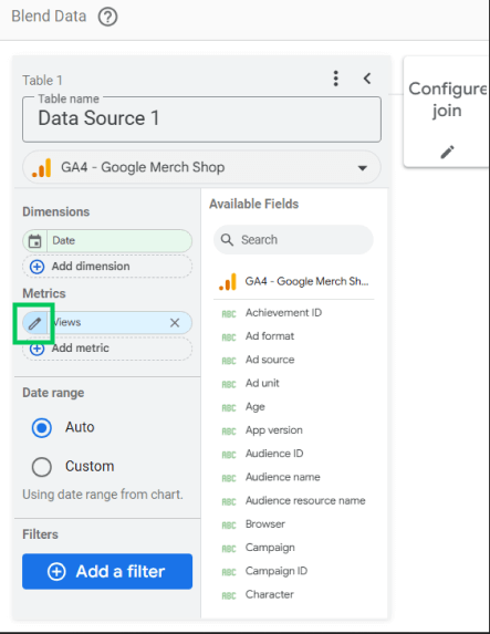
Tip: Ensure the names and data types of these Join Keys are identical across all blended tables. You can use the pencil icon next to the field name to rename or adjust the data type within the blending editor if necessary.
Step 5: Select the Other Dimensions and Metrics
For each of your tables, select the specific Dimensions (e.g., Campaign, Date, Device) and Metrics (e.g., Sessions, Conversions, Cost) that you need for your final chart.
Tip: Only include the fields you intend to use to keep the blend efficient.
Step 6: Choose the Data Blend Type
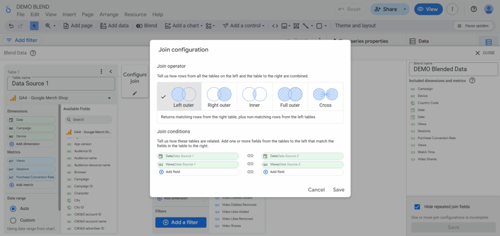
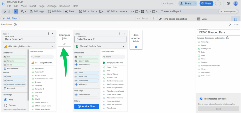
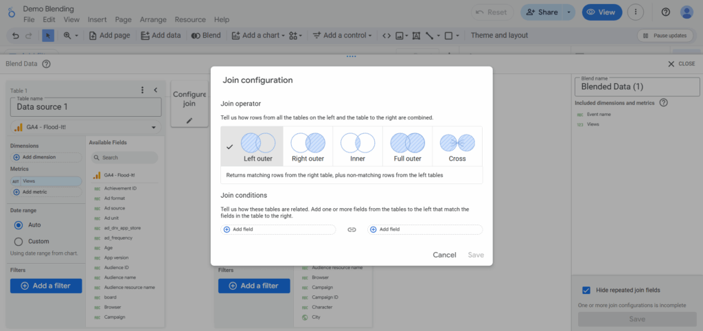
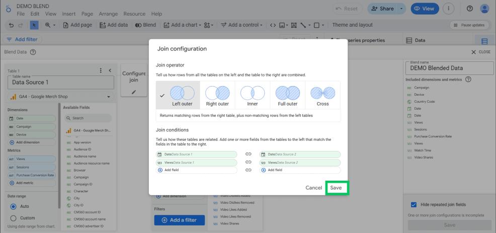
Click the small pencil icon between Table 1 and Table 2. This opens the Join Configuration menu.
Select your desired join type (e.g., Left Outer, Inner, etc.).
For most reporting needs, Left Outer Join is the best default choice. You can scroll up to reread Types of Data Blending in case you are confused about which works best for you when blending data in Looker Studio.
Step 7: Save the Blend
Click Save in the lower right corner.
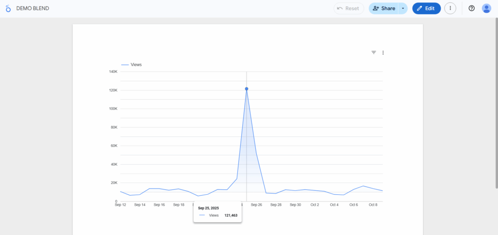
The newly created blended data source is now available in your chart’s Data Source field. You can drag and drop its dimensions and metrics to build your visualization.
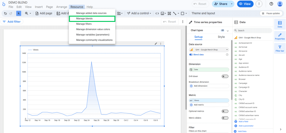
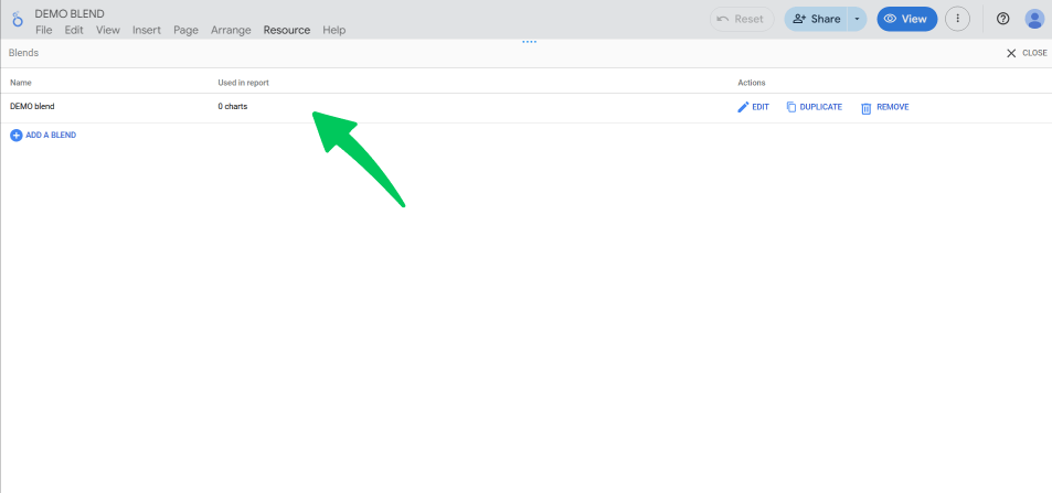
This blended source is saved in your report via Resource >> Manage blends.
This blend can now be reused across other charts you add to this report as well. Now you know how to blend data in Looker Studio.
How to Blend Data in Looker Studio Using Google Sheets
Google Sheets is arguably the most common and powerful data source for data blending. It allows you to inject custom, non-API-driven data into your reports. This also includes budgets, targets, manual offline conversions, or competitor data. Let’s explore how to blend data in Looker Studio utilizing Google Spreadsheets.
Requirements for Google Sheets Data Blending
To learn how to blend data in Looker Studio, we need to make sure of some prerequisites first, which are:
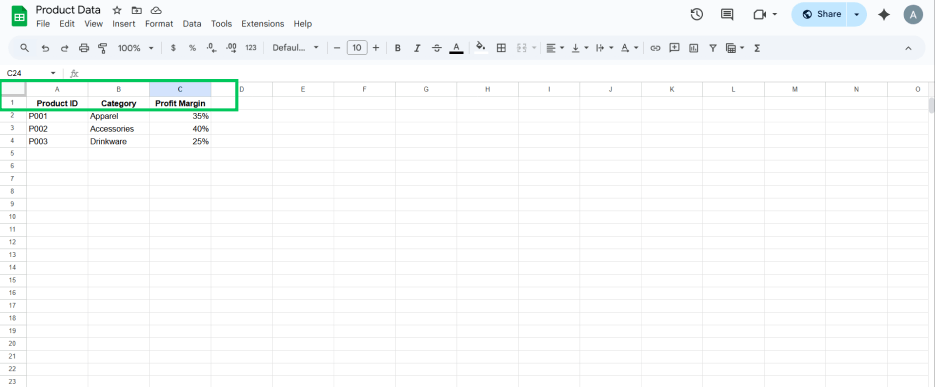
- Clean Data: Ensure the first row of your Google Sheet contains clear, unique header names (these become the field names in Looker Studio).
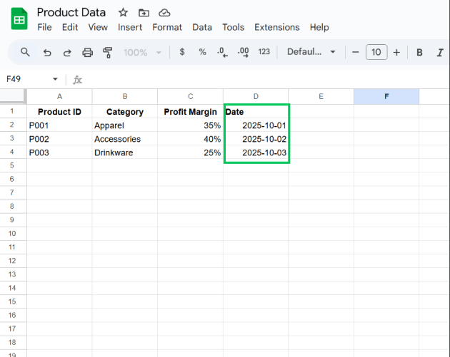
- Date/ID Key: You must have a dedicated Join Key column. If you are blending daily data, this column must contain the Date in a consistent format (e.g., YYYY-MM-DD).
The Sheets Blending Process
The steps are the same as the general how to blend data in Looker Studio process, but with two specific points of attention when connecting the Sheet:
Connecting the Sheet
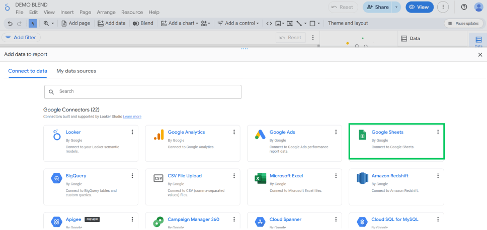
When adding your data source, choose the Google Sheets connector.
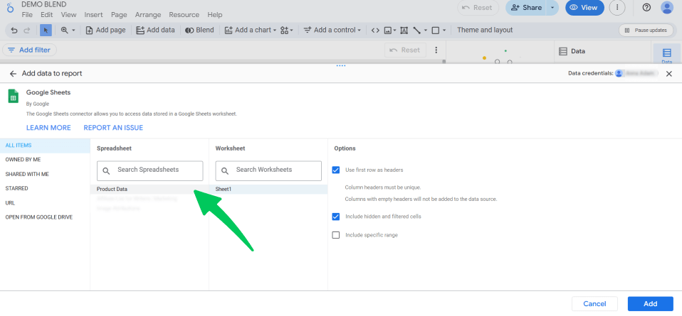
Select the correct spreadsheet and the specific worksheet within it.
Additionally, if the Sheet contains a date or time field that should act as a Join Key, check that Looker Studio correctly interprets it. You may need to adjust the data type manually.
One important point you should keep in mind while using Google Sheets is that the dates in Google Sheets are notorious for causing data type mismatches. If your Google Analytics ‘Date’ field is correctly set as a Date type, but your spreadsheet ‘Date’ field is imported as Number or Text, the blend will fail or return null results.
The simple solution is to use the pencil icon next to the spreadsheet date field in the blending configuration panel and explicitly change its type to Date (e.g., Date (YYYYMMDD) or Date & Time, depending on your data).
Using Google Sheets, you can combine budget data with your GA4 marketing channel metrics. For instance, you could join your ‘Planned Budget’ (from a Sheet) with your ‘Actual Spend’ (from Google Ads) using ‘Month’ and ‘Campaign Name’ as your standard Join Keys.
This will provide instant budget tracking and variance analysis directly in your dashboard. This use case is often the most crucial reason why blending data in Looker Studio is such a helpful skill.
Best Practices on How to Blend Data in Looker Studio
Data blending in Looker Studio is only the first step; the actual value comes from how you visualize and utilize the combined metrics in your reports. Effective Looker Studio reporting requires using the blended source to create visualizations that answer cross-source questions. Let’s go through some of the best practices you can follow to make sure your Looker Studio data blending is efficient and accurate:
1. Focus on Unified KPIs (Key Performance Indicators)
Instead of simply displaying two separate charts side-by-side, reports should utilize the blended data to create new, unified metrics that answer strategic business questions, since the primary reason to blend data is to calculate a metric that can’t exist in a single source.
I recommend creating calculated fields directly within the blended source. You can make this unified KPI the main point of your report. For example, Total Revenue from Google Analytics combined with Total Cost from Google Ads to calculate a single Return on Ad Spend (ROAS) metric.
2. Ensure Consistent Dimensions
A standard reporting error occurs when blending data with dimensions that don’t align, resulting in uneven or misleading visuals. Therefore, ensure that the blended data relies on standard join keys. The visualization must involve that common point.
The best practice would be to use a single, consistent Date Dimension (like Date or Week) and Group-By Dimension (like Campaign Name or Device Category) across all charts driven by the blend. This ensures that every metric is being compared on the same core basis and maintains data integrity.
3. Use Scorecards for Immediate Cross-Source Impact
Scorecards are the quickest way to show the power of data blending by reducing key figures. A high-level view is needed to validate the blend’s success and provide instant value to the report’s viewers.
For this, the best practice I recommend using is to create Scorecards showing the blended KPIs. For example, a single scorecard showing Cost per Acquisition (CPA) where Cost comes from one source and Acquisitions come from another immediately demonstrates the combined value.
4. Implement Conditional Formatting for Highlights
Effective reports guide the user’s attention to anomalies or key performance thresholds. Blended metrics often represent business goals; hence, the visualization should reveal if those goals are being met.
You can apply conditional formatting to tables or scorecards using your blended metrics. For instance, automatically color-code the ROAS metric red if it falls below the break-even point or green if it exceeds a target value.
5. Validate the Blend with Comparison Tables
Before deploying the final report, consider including a validation step to ensure the blend works as expected. Sometimes, data mismatches, key duplication, or incorrect join configurations can result in silently wrong data.
It is suggested to create a small, temporary table that displays the original metrics from the separate sources alongside the final blended metric. Once validated, you can hide or remove this table from the final user view.
Tips for Efficiency and Clarity
In conclusion, here are some simple tips you can follow to ensure your blends are efficient and transparent for the best analysis reports.
- Keep Blends Simple: Limit the blend to only the metrics and dimensions required for the specific chart. Avoid blending 20 fields when you only need 3.
- Rename Fields Clearly: In the blending configuration panel, rename the fields to avoid ambiguity. This prevents confusion in custom metrics.
- Use Calculated Fields: Most critical cross-source KPIs (like ROAS, CPA, etc.) must be defined as calculated fields within the blended data source or the chart itself.
Track Your Data Analytics Using Analytify (WordPress Users)
Join 50,000+ beginners & professionals who use Analytify to simplify their Google Analytics!
Analytify is the ultimate WordPress analytics solution that helps you make smarter, data-driven decisions right from your dashboard. It goes beyond basic tracking by offering in-depth performance reports and detailed insights into your eCommerce transactions, and everything is powered by Google Analytics data.
With Analytify, you can easily organize and interpret your internal data, ensuring accuracy and consistency across every metric. It simplifies complex reporting tasks, automates key data processes, and delivers actionable insights in an easy-to-manage format.
Here are some of the top features Analytify offers to help you manage and optimize your website data effortlessly so your blends come out effectively:
- Detailed and Segmented Overview Dashboard
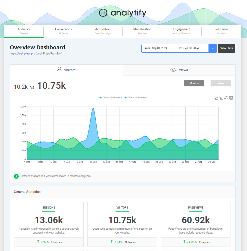
Analytify provides users with a detailed overview dashboard integrated right into their WordPress dashboard. From key metrics to geographical metrics, everything is presented to the user in their WordPress.
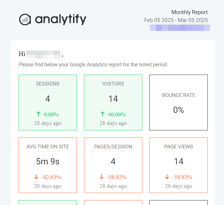
With the Email Notifications add-on, you will receive your website analytics in your inbox on a weekly or monthly basis, whichever you prefer.
With Analytify, you can say goodbye to struggling with mismatched Google Sheets dates or complex multi-step blends, because Analytify provides the clean, unified data foundation you need to build the most reliable cross-platform reports in Looker Studio.
Frequently Asked Questions
1. How to blend data in Looker Studio from two different Google Analytics 4 properties?
Yes. Treat each GA4 property as a separate data source. Connect both and blend them using a shared key, such as ‘Date’ or a custom ‘Client ID’ if available and consistent.
2. Why are my blended metrics showing null or zero?
This nearly always indicates an issue with the Join Key. Check three things:
1) Are the Join Key names identical?
2) Are the data types (especially Date fields) identical?
3) Is there data in the ‘Right’ table for the ‘Left’ table keys being used (for Left Outer Joins)?
3. What is the maximum number of data sources I can blend?
Looker Studio allows you to blend a maximum of five tables into a single blended data source. For more complex needs, consider using BigQuery to preprocess and join your data before connecting it to Looker Studio.
4. Should I use Inner Join or Left Outer Join?
For general reporting and dashboards, Left Outer Join is highly recommended. It prevents data loss and ensures you see all rows from your primary (Left) table, even if the secondary data is missing. Use Inner Join only when you specifically want to filter out non-matching data.
Data Blending in Looker Studio: Conclusion
Learning how to blend data in Looker Studio is the most critical skill for detailed and comprehensive reports. The main goal is straightforward: understand the different join types and ensure that your connecting fields (Join Keys) are an exact match.
This technique is powerful because it lets you easily add custom information from Google Sheets right into your report. Blending moves your reports beyond basic data summaries, giving you a complete, visual strategy. This skill enables you to accurately calculate important metrics, such as ROAS (Return on Ad Spend) and CPA (Cost Per Acquisition), marking you as an advanced Looker Studio user. This is all for this post. For more related posts, check out:
- Analytify vs Looker Studio (Detailed Comparison)
- Google Analytics 4 and Looker Studio: Unified Analytics
- Analyzing Content Engagement with Google Analytics 4 Funnels
Are you ready to merge your data sources and create a perfect blend of visuals and analytics? Are you prepared to unlock next-level insights by using Analytify to track and clean your data sources?

