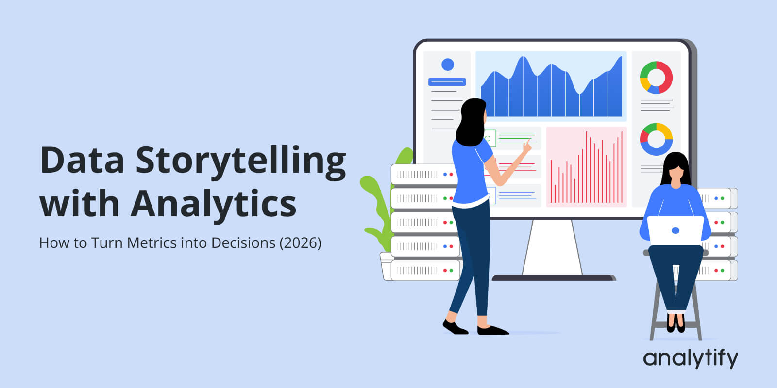
Data Storytelling with Analytics: How to Turn Metrics into Decisions (2026)
Data storytelling with analytics is about turning numbers into stories that actually help you make decisions.
Every day, your GA4 dashboard generates a flood of metrics, sessions, pageviews, and bounce rates, but numbers alone don’t tell the full story. Data storytelling with analytics transforms these raw numbers into actionable insights, helping teams understand what happened, why it happened, and what to do next.
In 2026, with AI-powered summaries and smarter reporting tools, the ability to turn metrics into decisions is more critical than ever. Plugins like Analytify make GA4 data easy to read and act on, so your analytics stop being confusing dashboards and start being business-driving stories.
In this guide, I’ll show you how to use data storytelling to make GA4 analytics meaningful, including practical examples, best practices, and a step-by-step checklist for decision-ready reporting.
Data Storytelling with Analytics (TOC):
What is Data Storytelling with Analytics?
Data storytelling with analytics is the practice of turning raw numbers into meaningful stories that guide businesses in data drive decision making.

The Three Pillars: Data, Insight, Narrative
It combines three elements:
- Data (What happened) – The actual metrics, like sessions, pageviews, engagement rate, conversions, and events. These are the facts from your GA4 dashboard.
- Insight (Why it happened) – The interpretation of the data. For example, traffic dropped because a key landing page lost visibility in search, or engagement increased due to a new content update. Insight explains patterns and trends behind the numbers.
- Narrative (What should be done) – A clear explanation that connects the data and insight to action. Every story should answer: what’s the impact on the business, and what is the next step?
How does data storytelling with analytics differ from traditional analytics reporting?
- Traditional analytics reports focus on numbers, charts, and historical trends.
- Data storytelling goes beyond reporting to explain why results occurred and what actions to take.
This approach makes analytics easier to understand for non-technical teams and executives, and ensures that metrics drive decisions instead of confusion.
In practice, data storytelling with analytics does not mean adding opinions. It’s about adding context and meaning to data. For example, instead of reporting “bounce rate is 70%,” a data story would explain “bounce rate is 70% because users can’t find the signup form, consider repositioning the CTA.”
Using data storytelling with analytics ensures that your GA4 metrics are not just numbers on a screen. They become insights that guide you in data driven decision making and improve business outcomes.
Why Data Storytelling with Analytics Matters in 2026
Raw metrics alone are not enough. Too many numbers can overwhelm teams, leading to analysis paralysis. Not all metrics are useful; vanity metrics like pageviews or total clicks may look good, but don’t always drive decisions.
Problems with raw metrics:
- Too many metrics make it hard to see what matters.
- Numbers without context can lead to wrong conclusions.
- Executives and non-technical teams struggle to understand dashboards.
Benefits of data storytelling with analytics:
- Provides clarity: Shows what happened, why, and what to do.
- Supports alignment: Teams focus on shared goals rather than isolated numbers.
- Reduces misinterpretation: Ensures GA4 metrics lead to accurate insights.
- Makes analytics accessible: Marketers, content teams, and managers can act confidently.
Humans understand stories better than charts. A narrative connects metrics to real-world outcomes, making analytics insights easier to remember and act on. Executives prefer decision-ready insights over raw dashboards, when AI tools and automated reporting highlight trends but still require human interpretation for decisions.
The 3 Core Components of Effective Data Storytelling
Effective data storytelling with analytics relies on three key elements: Data, Insight, and Narrative/Decision.
Each element plays a distinct role in turning metrics into actions.
1. Data: What Happened
This is the foundation of the raw numbers from GA4 or Analytify dashboards.
Examples include:
- Sessions – how many users visited your site
- Engagement rate – how actively users interact with content
- Events – clicks, form submissions, video plays
- Conversions – goal completions or purchases
Choosing the right metrics is crucial. Focus on numbers that tell a story about business performance, not everything on the dashboard. Simplified dashboards help highlight what matters most.
2. Insight: Why It Happened
Metrics alone don’t explain the story. Insight interprets the data:
- Example: Traffic dropped vs traffic dropped due to a specific campaign ending
- Example: High bounce rate vs users leaving because they found answers quickly
Segmentation, comparisons, and trends are key tools to uncover these insights. They turn raw metrics into understanding.
3. Narrative and Decision: What Should Be Done
Every data story needs a clear action. Narrative connects data and insight to business decisions:
- Example: “Bounce rate is high because users can’t find the signup button. Move the button above the fold to improve conversions.”
- Example: “Blog traffic spiked due to a social media campaign. Promote similar content to maintain engagement.”
Ending with actionable recommendations ensures your analytics work drives real results. Without a clear “next step,” even the best insights can be wasted.
Storytelling with Data Analytics: Real-World Examples

Data becomes useful only when it drives decisions. Let’s understand storytelling with data examples in real scenarios:
1. Content Performance Example of Data Storytelling with Analytics
Metrics to track: blog traffic, engagement rate, and assisted conversions.
- Insight: A blog post with high pageviews but low engagement may attract clicks but fail to retain readers.
- Decision: Update the content, add visuals, or repurpose for other channels to increase engagement and conversions.
2. Marketing Funnel Example
Metrics to track: traffic source, engagement, conversion.
- Insight: Users drop off at a specific stage, e.g., product page visits, but with low add-to-cart actions.
- Decision: Focus marketing efforts on channels bringing high-quality traffic, optimize pages where users drop off, or test new CTAs.
3. E-commerce or SaaS Journey Example
Ecommerce metrics to track: product views, add-to-cart, checkout, purchase.

- Insight: High add-to-cart but low checkout indicates friction in the purchase process.
- Decision: Improve UX, simplify checkout steps, or adjust messaging to reduce drop-offs.
In each example, the key steps are:
- Look at metrics (what happened)
- Interpret insights (why it happened)
- Define actions (what should be done)
By applying storytelling, analytics shift from static dashboards to decision-making tools, helping teams act confidently. Using plugins like Analytify, these metrics are simplified into clear reports, making it easier to identify trends, spot issues, and make decisions fast.
Analytics Reporting Best Practices for Storytelling
To make your data actionable, reporting should tell a clear story rather than just show numbers. Follow these best practices:
1. Start with a Business Question
Every report should answer a specific question. Avoid reporting everything. For example: “Which marketing channels drive the most engaged users?” keeps the focus clear.
2. Select Metrics That Support Decisions
Choose metrics that tie directly to your goals. Vanity metrics, like total pageviews, are useful only if they support an insight. Focus on engagement, conversions, revenue, or other decision-driving KPIs.
3. Use Visuals to Support the Story
Graphs, trend lines, and comparisons highlight patterns and anomalies. Include annotations or summaries instead of cluttering charts with raw numbers. A simple line chart showing traffic trends over time can tell a clearer story than a table of raw data.
4. Keep Reports Simple and Focused
One report = one main story. Don’t overload stakeholders with too much information. Prioritize clarity over completeness.
5. Always End with Recommendations
Reports should guide action:
- What should the team test or improve?
- Which campaigns should continue or stop?
- Which content needs updating?
Following these practices ensures your analytics reports do more than show numbers. They provide insight and drive action. Plugins like Analytify make it easier by creating dashboards and reports that highlight only the most meaningful metrics, ready for storytelling.
How Analytify Helps Turn Analytics into Stories
Join 50,000+ beginners & professionals who use Analytify to simplify their Google Analytics!
Turning GA4 data into decisions can be complex, but Analytify simplifies the process for WordPress users. Here’s how it supports data storytelling:
1. Simplifying GA4 for WordPress Users
Analytify pulls GA4 data into easy-to-read dashboards, highlighting the most important metrics. Instead of scrolling through raw numbers, users see sessions, engagement rates, conversions, and content performance in one place.

2. Reports That Support Storytelling
Analytify offers pre-built reports that focus on decision-driving metrics:

- Traffic and engagement reports – show how users interact with your site.
- Conversion and goal tracking – reveal which actions lead to business outcomes.
- Content and eCommerce insights – identify top-performing pages, products, or campaigns.
These reports provide the “data” layer of your story while making trends and patterns easy to spot.
3. From Insights to Decisions
With Analytify, insights are immediately actionable:
- Spot traffic drops or spikes and understand the underlying cause.
- Identify high-performing content or products to double down on.
- Track conversion funnels to find friction points and improve UX.
4. Ideal for AI Summaries and Executive Reviews
Analytify’s clear dashboards make it easy to generate decision-ready insights for reports, team meetings, or client updates. Executives don’t need to interpret charts. They get answers to “What’s working?” and “What needs improvement?”
By combining clear visuals, relevant metrics, and actionable insights, Analytify transforms GA4 data from overwhelming numbers into compelling stories that guide real business decisions.
Checklist: Turning Metrics into Decisions
Use this simple checklist to turn your analytics data into actionable decisions:
- Define the decision you need to make
- Be clear about the business question you want to answer.
- Be clear about the business question you want to answer.
- Choose metrics aligned with that decision
- Focus on KPIs that directly impact your goal.
- Focus on KPIs that directly impact your goal.
- Add context through comparisons or trends
- Compare time periods, segments, or campaigns to understand patterns.
- Compare time periods, segments, or campaigns to understand patterns.
- Identify the insight behind the numbers
- Ask why the metrics are changing and what it means.
- Ask why the metrics are changing and what it means.
- Explain the impact on business goals
- Connect the insight to revenue, conversions, engagement, or other outcomes.
- Connect the insight to revenue, conversions, engagement, or other outcomes.
- Recommend a clear next action
- Define exactly what should be tested, improved, or stopped.
- Define exactly what should be tested, improved, or stopped.
- Review and refine regularly
- Keep reports updated and adjust decisions as new data comes in.
- Keep reports updated and adjust decisions as new data comes in.
This checklist helps ensure that analytics reporting is not just about numbers—it guides decisions, aligns teams, and drives measurable business outcomes. It’s also easily adapted into a visual checklist or infographic for quick reference.
Frequently Asked Questions
1. What is data storytelling with analytics?
It’s the process of turning raw data into understandable insights by combining data (what happened), insight (why it happened), and a narrative (what should be done next). This helps teams make informed decisions instead of just looking at numbers.
2. How is data storytelling different from data visualization?
Data visualization is about showing data with charts and graphs. Data storytelling uses visuals, context, and interpretation to explain meaning and connect it to business decisions. The narrative is what makes data memorable and actionable.
3. Why can’t I just use dashboards without storytelling?
Dashboards show metrics but don’t explain why changes are happening or what action to take. Storytelling adds context and makes your analytics useful for teams and executives.
4. What metrics should I focus on for a good data story?
Choose metrics tied to your business goals, such as conversions, engagement, and revenue, not just total pageviews or raw numbers. The right metrics help you tell a clear, decision-ready story.
5. How do I explain the “why” behind the data?
Use comparisons, trends, and segmentation to dig deeper. For example, compare time periods or segments to understand patterns rather than reporting numbers alone. Asking “why” repeatedly, such as why traffic dropped, can uncover deeper causes.
6. Who benefits most from data storytelling?
Marketers, managers, executives, and clients all benefit because storytelling makes analytics understandable and actionable, especially for non‑technical audiences.
7. Can data storytelling work with automated tools?
Yes. Tools like Analytify simplify complex GA4 data into understandable reports, making it easier to build stories without manual analysis.
Data Storytelling with Analytics: Conclusion
In 2026, simply collecting data is not enough. Data storytelling with analytics turns raw GA4 metrics into meaningful insights that drive real business decisions. By combining data, insight, and narrative, teams can understand what happened, why it happened, and what actions to take next.
This shift from dashboards to decisions is critical for marketers, content teams, executives, and business owners. Analytify makes this process simple, turning complex analytics into clear, actionable reports.
By adopting data storytelling as a core practice, you ensure that your analytics do more than just report numbers. They guide strategy, improve performance, and align teams around measurable goals. Start focusing on stories, not just metrics, and your analytics will finally deliver the decisions you need.
Further Readings:
So, which part of your analytics could you start turning into a story today to make smarter decisions?