How to Create Custom Reports in Google Analytics (2026)
Are you looking to make Google Analytics work exactly how you need it?
Custom reports in GA4 give you the power to do just that. Instead of relying on general, one-size-fits-all reports, custom reports let you focus on the specific data that matters most to your business.
In this guide, we’ll explore how to create, customize, and make the most out of custom Reports in Google Analytics, so you can keep your analytics truly aligned with your business needs.
Let’s get started!
Custom Reports in Google Analytics (TOC):
What are Custom Reports in GA4?
Custom Reports in Google Analytics refer to personalized reports that you can create to focus on specific metrics and dimensions tailored to your business needs. Unlike standard reports, which provide predefined data views, Google Analytics custom reporting allow you to build reports from scratch based on precisely what you want to track, such as user behavior, traffic sources, conversions, or events.
With GA4 Custom Reports, you can:
- Select specific metrics (e.g., sessions, conversions, bounce rate).
- Choose relevant dimensions (e.g., user location, device, traffic source).
- Apply filters to refine the data for more granular insights.
- Visualize the data in a way that best fits your analysis using tables, charts, or graphs.
Create a custom report in Google Analytics gives you greater control over your data analysis and helps you focus on the key performance indicators (KPIs) most important for your business.
Differences Between Standard and Custom Reports in GA4
Here’s a table presenting the differences between Standard and GA4 Custom Reports :
| Feature | Standard Reports | Custom Reports |
| Structure | Comes with predefined dimensions and metrics. | You can define your dimensions and metrics. |
| Customization | Limited to basic filtering and secondary dimensions. | Fully customizable with chosen metrics, dimensions, and filters. |
| Data Scope | Generally covers default reports like Acquisition, Engagement, etc. | Focused allows the selection of specific data points for deeper insights. |
| Flexibility | Rigid structure with preset views and data. | Highly flexible, you can create reports according to your exact needs. |
| Visualization Options | Standard charts and tables based on prebuilt reports | Customizable visuals (tables, charts) based on your data selection. |
| Use Case | Best for general analysis and quick overviews. | Ideal for specific, in-depth analysis of custom metrics or KPIs. |
| Time to Set Up | Ready to use, no setup required. | Requires manual setup |
| Filtering Options | Limited to default filters within the report | Extensive, with the ability to apply custom filters and segments. |
| Specificity | Covers overall user activity and traffic trends. | Focusing on specific interactions, user behaviors, or events. |
Benefits of Custom Reports
Here are the Benefits of Custom Reports in GA4:
- GA Custom reports allow you to focus on specific metrics and dimensions that matter most to your business, giving you personalized details rather than general data.
- Custom reports highlight the key performance indicators (KPIs) important to your goals and provide more precise details that help you make decisions and optimize marketing strategies.
- With custom filtering, segmentation, and detailed metric selection, custom reports offer a more precise and in-depth analysis of user behavior and campaign performance.
- Instead of searching standard reports for relevant data, custom reports in GA4 streamline the process by presenting only the needed data, saving you time.
- Google Analytics Custom reports allow you to choose the most effective way to visualize your data through tables, charts, or graphs, making analysis easier and more impactful.
These benefits make GA custom reports an essential tool for any business looking to get the most out of their data and analytics.
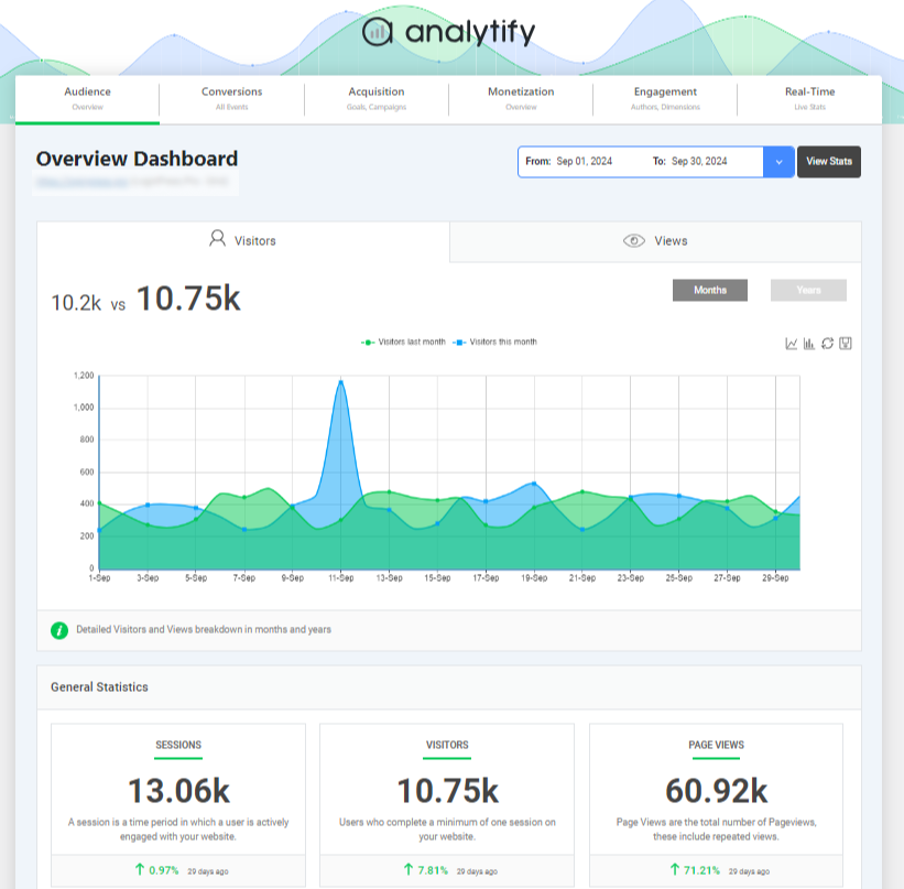
Analytify plays a significant role in simplifying GA4 custom reporting, especially for WordPress users. This powerful plugin integrates seamlessly with GA4, presenting complex data in an easy-to-read dashboard within the WordPress interface. With Analytify, you can view essential metrics and dimensions without navigating away from your site, streamlining data analysis and reporting.
It enhances GA4’s capabilities by offering real-time insights, detailed user behavior tracking, and customizable reports tailored to business needs. This integration ensures that users easily make decisions, boosting efficiency and understanding of site performance.
Types of Custom Reports in GA4
The following are 3 main types of custom reports in Google Analytics:
- Free-Form Exploration: An adaptable report where you add data elements in rows/columns and visualize using various chart types. It’s suited for comprehensive user behavior analysis.
- Path Exploration is Ideal for tracking specific user journeys, showing how users move through pages or events. It’s also beneficial for identifying popular paths or drop-off points.
- Funnel Exploration: Used to visualize conversion paths, showing the sequence of user actions before a goal (e.g., purchase). Closed funnels track only users who start at the first step, while open funnels allow users to enter at any stage.
Main Components of GA4 Explorations (Custom Reports)
To get started, click on Explore in the left-hand menu of the Google Analytics 4 interface. One of the most powerful tools available is the Free Form Exploration, which I frequently use for custom analysis, so let’s select that option.
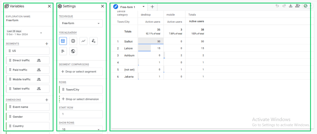
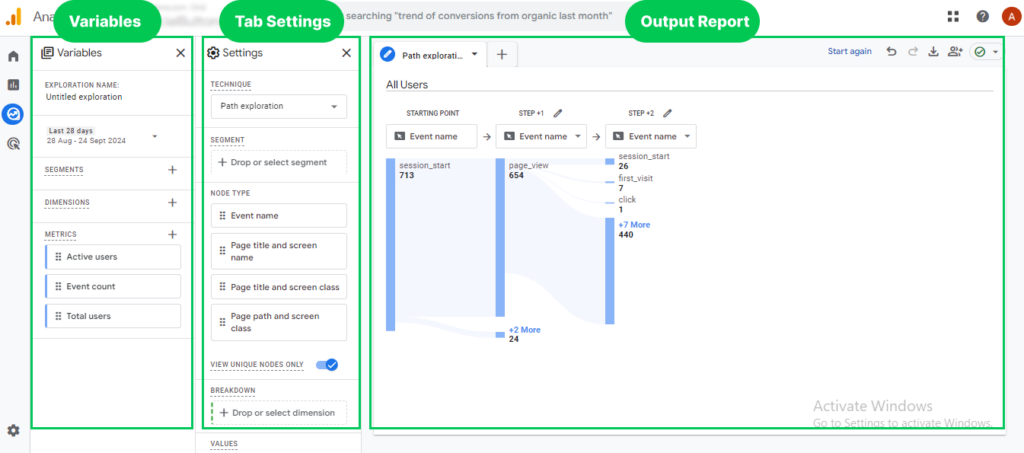
The Explorations interface is divided into three key sections:
- Variables
This section controls the segments, dimensions, and metrics from which you can build your custom report. - Tab Settings
This section determines how the data is structured and displayed in your report, allowing you to configure the report to suit your needs. - Output
The final section is the output, which displays the report generated based on the selections and configurations you’ve made in the previous sections.
Now, let’s explore each part individually.
Setting Up Custom Reports in GA4 using Explorations
Custom reports in GA4 allow you to harness interactive features, such as drag-and-drop functionality, customizable visualizations, and advanced data filtering.
In the following sections, we’ll explore how to create custom reports in Google Analytics step by step, each designed to provide a deeper understanding of your website’s performance, user behavior, and conversion pathways.
Creating a Free-Form Exploration Report in Google Analytics 4 (GA4)
Creating a Free-Form Exploration report in Google Analytics 4 (GA4) is an effective way to analyze and visualize your data comprehensively. This guide walks you through each component of the custom report, ensuring you understand how to set up and customize your exploration effectively. So, the main three sections of the free-form exploration report are:
- Variable section
- Tab settings
- output/report section
Let us start each section one by one.
Variables Section
The Variables section is crucial for selecting the data elements you intend to use in your report. This section is distinct from Google Tag Manager’s variables and includes the following components:
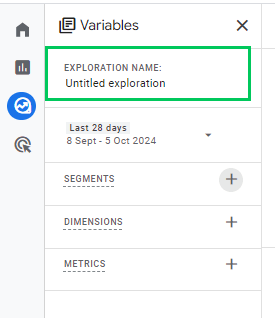
- Naming Your Exploration:
- You can customize the name of your exploration by clicking the current name located in the top-left corner of the interface.
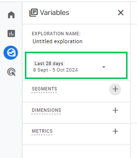
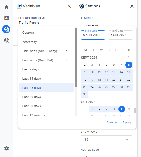
- Changing the Date Range:
- Click on the date selector below the exploration name.
- Choose a predefined range like “Last 7 Days” or “Last 30 Days,” or set a custom date range as needed.
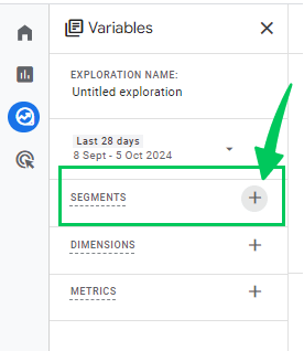
- Add Segments:
Segments allow you to compare the behavior of different user groups within your data. For Adding Segments:
- Click the plus (+) icon in the Segments section.
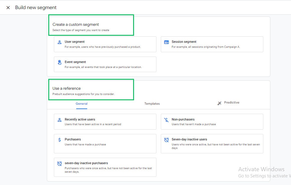
- Choose to create a custom segment or select a suggested one.
For detailed information on segments, refer to this comprehensive guide on How to Create Advanced Segments in Google Analytics.
- Choose Dimensions and Metrics
Dimensions and Metrics are the building blocks of your report:
- Dimensions: These are descriptive attributes that provide context to your data, such as Event Name, Transaction ID, Product Category
- Metrics: These numerical measurements quantify your data, such as Event Count, Number of Active Users, Number of Transactions, and Engagement Rate.
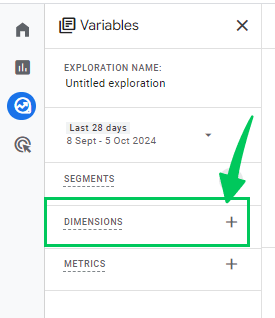
Utilizing a dimension or metric in your exploration must first be added to the Variables section.
- Click the plus (+) icon, select the desired dimension or metric, and click the Apply button in the top-right corner.
Tab Settings
The Tab Settings column allows you to customize the appearance and structure of your report.
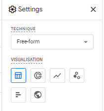
- Technique Selection:
- Choose the type of exploration (e.g., Free-Form, Funnel Exploration). This guide focuses on form exploration.
- Visualization Options:
The following visualization options are available.
- Donut Chart
- Line Chart
- Scatterplot
- Bar Chart
- Geo Map
Each visualization type offers unique customization options.
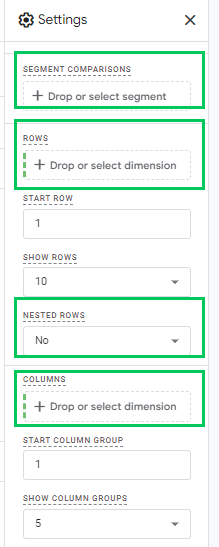
- Segment Comparisons
Segment Comparisons enable you to analyze up to four segments simultaneously. For Adding Segments:
- Drag segments from the Variables tab into the Segment Comparisons section.
- Alternatively, double-click a segment in the Variables tab to add it automatically.
- Rows and Columns
Assign dimensions to the Rows section to structure your table.
- Nested Rows: For hierarchical data, switch to nested rows to display dimensions in a nested format.
Similar to Rows, you can assign dimensions to the Columns section.
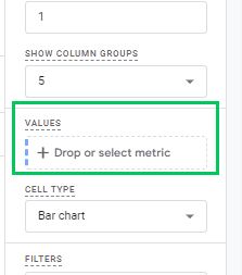
- Values
- The Values section is where you add the metrics you want to display in your report.
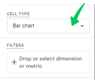
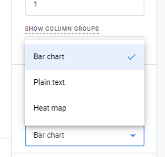
- Cell Types:
- Bar Chart: Displays horizontal bar charts within each metric cell, visualizing the value relative to other rows.
- Plain Text: Shows numerical values without additional visuals.
- Heat Map: Colors cells based on their values, with higher values appearing darker.
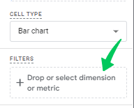
- Filters
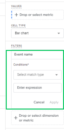
Filters help refine the data displayed in your report by including or excluding specific data points. For Applying a Filter:
- Click on the filter in the Filters section.
- Select the dimension you want to use for filtering.
- Define the filter conditions (e.g., exclude a particular event).
Output (Report)
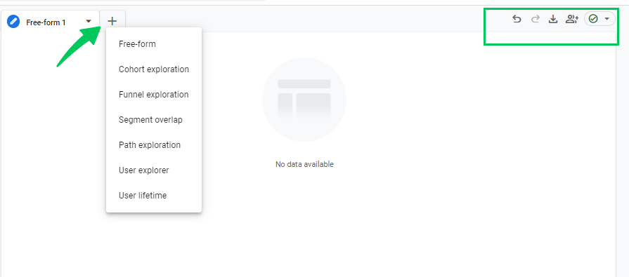
After configuring the Variables and Tab Settings, your report will generate based on your selections. Here’s how to interact with and manage your report:
- Duplicate or Delete Tabs: Click the triangle icon next to a tab name to duplicate or remove it.
- Add New Tabs: Use different exploration techniques within the same report.
- Undo/Redo: Revert or reapply changes using the Undo and Redo options.
- Share and Download: Share the report with others or download it offline.
By following this guide, you’ll be well-equipped to navigate and utilize the GA4 Free-Form Exploration feature, which provides detailed information about your website or application’s performance.
Creating Path Exploration Report
This section will explore the GA4 Path Exploration interface, emphasizing its features and functionality. To start, navigate to the left sidebar, click Explore, and select Path Exploration.
The interface is divided into three main sections:
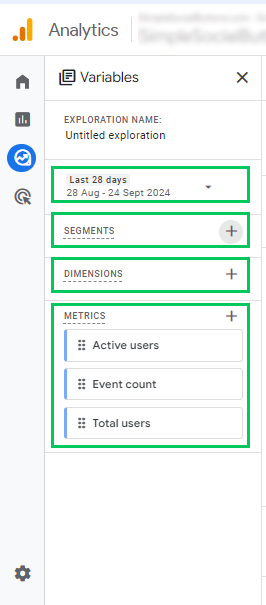
- Variables
- Tab Settings
- Output (Report/Visualization)
Variables
The Variables section allows you to select the data you want to use in your report. Here, you can adjust:
- Name the report: Add a name to the new exploration report.
- Date Range: Click on the date in the top-left corner to select your desired date range (e.g., “last 7 days” or “last 30 days”).
- Segments: Analyze different user groups by selecting existing segments or creating custom ones by clicking the plus icon. There are three types of segments you can create:
- User Segment: Captures all users meeting specific criteria (e.g., users from the US).
- Session Segment: Captures sessions meeting certain criteria (e.g., sessions where a specific event occurred).
- Event Segment: Focuses on specific events (e.g., only page_view events).
- Dimensions and Metrics:
Dimensions describe attributes (e.g., Event name, User’s pricing plan), while metrics measure values (e.g., Event count, Engagement rate).
For Path Exploration, you can only use three metrics: Active users, Event count, and Total users. Ensure any metric or dimension you want to use is included in this section first.
Tab Settings
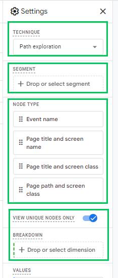
In the Tab Settings section, you can configure how your report looks. Key features include:
- Technique: Choose the type of analysis (Path Exploration in this case).
- Segment: Add a segment to analyze a subset of your data.
- Node Type: This shows the nodes you can use, including the Event name and Page title.
- View Unique Nodes Only: Toggle this option to see unique nodes in your visualization or all occurrences.
- Breakdown: Add dimensions for further analysis (e.g., Device category) to compare user behavior.
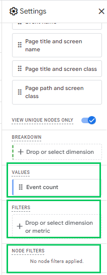
- Values: Choose which metric to display in the path exploration visualization (Active users, Event count, Total users).
- Filters: Add filters to narrow your data analysis. However, if you encounter issues with filters, creating an Event segment might be more effective.
- Node Filters: Exclude specific nodes from your visualization by right-clicking the node and selecting the exclusion option.
Output (Report)
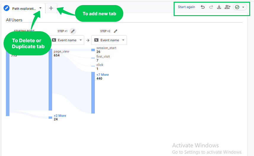
Once the Variables and Tab Settings are configured, the Output section will display the path exploration visualization. Here are some key functionalities:
- Add Tabs: Create multiple tabs, each with different exploration techniques. You can also delete or duplicate a tab.
- Changing Starting Points and other options: To change the starting point, click Start Over. It will reset the visualization while keeping your settings intact. You can redo, undo, download, and share the report.
Funnel Explorations in Google Analytics 4
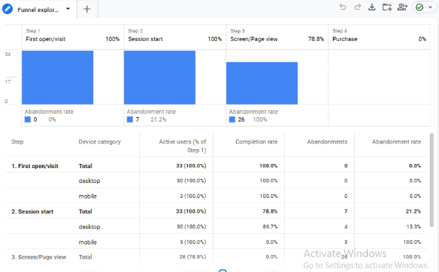
Funnel exploration is a widely used method in GA4 custom reports. It details the stages users pass through before completing a specific action. Funnel exploration reports help analyze user behavior and conversion paths, making them invaluable for conversion optimization and understanding drop-offs.
When working with funnel explorations in GA4, the interface remains consistent across different exploration types. It has three primary columns:
- Variables
- Tab Settings
- Report output
This layout lets you track key exploration elements while customizing each tab.
Variables
If you’re using multiple explorations (e.g., a Free Form tab and a Funnel tab), note that the Variables column remains the same across all tabs. At the same time, Tab Settings differ according to the type of exploration you choose.
Tab Settings
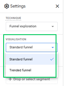
Visualization Options
GA4 provides two main funnel visualization types:
- Standard Funnel – This is the traditional bar chart, displaying the number of users at each step and highlighting the drop-off rate between steps.
- Trended Funnel – A line chart representing each step by a line, allowing you to observe funnel performance over time. Click on a line to highlight it, or use the tabs above the chart to view individual funnel steps.
Using the Trended Funnel makes analyzing how user behavior evolves easier than the Standard Funnel, which offers a straightforward snapshot of each step.
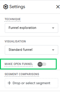
Open vs. Closed Funnels
GA4 funnels are closed by default, meaning only users who enter at the first step are counted. However, if you want to allow users to join the funnel at any step, you can toggle on the Make open funnel option. This option provides flexibility in tracking, which is beneficial for broader user journeys.
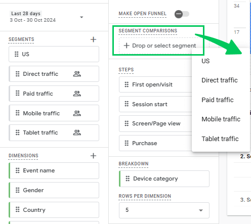
Segment Comparisons
The Segment Comparisons feature in GA4 lets you add up to four segments for comparison within the funnel. You can select these segments from the Segments section of the Variables tab and drag them to the Tab Settings.
Each segment will appear as a unique bar or line within the funnel chart, depending on the selected visualization. While this is useful in the Standard Funnel, segment comparisons in the Trended Funnel can become complex, as each step and segment combination results in additional lines.
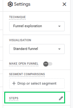
Configuring Funnel Steps
To define funnel steps:
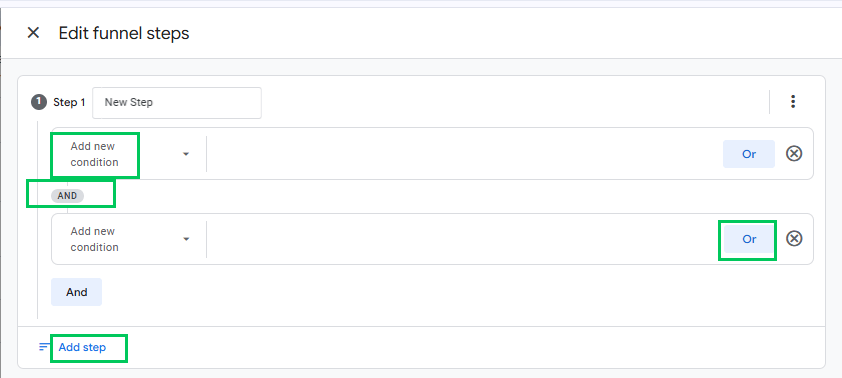
- You can edit steps by clicking the Pencil icon next to each one. You can delete, add, or rename steps here.
- Add conditions based on dimensions (custom or default) in your GA4 property for each step. For multiple conditions, use logical operators like AND and OR.
- Click Add new condition and select a dimension to add a new condition. If a dimension is not registered as a custom definition, you will be prompted to register it.
- Configure follow-up settings such as directly or indirectly following the previous step and set a maximum time difference between steps.
- Click Apply once you’ve configured the steps to update your funnel.
Funnel Output
Once generated, the funnel report becomes interactive:
- Right-Click Options – Right-clicking a bar in the funnel allows you to create segments or view users in the User Explorer report.
- Abandonment Interactions – Click on the abandonment numbers to create segments or view further details, though note that not all elements are clickable.
GA4’s funnel exploration offers versatile analysis options through open/closed funnels, segment comparisons, and visual breakdowns, making it a valuable tool for examining and optimizing user journeys.
Customizing Dimensions and Metrics
Customizing dimensions and metrics is key to building effective custom reports in GA4. By selecting the right combinations, you can align data visualization with your business needs, making it easier to draw relevant results. Dimensions in GA4 represent the attributes of your data, while metrics quantify these dimensions.
We’ll guide you through choosing dimensions and metrics in the following subsections.
Understanding GA4’s Dimensions and Metrics
In Google Analytics 4 (GA4), dimensions and metrics are essential for analyzing your website or app data.
- Dimensions provide descriptive information about the data, such as the event name, user’s geographic location, or device type. They offer context to what is happening by outlining the attributes related to user behavior, traffic sources, or specific actions on your site.
- Metrics, on the other hand, quantify the data. They are numerical values that help measure performance, such as event count, conversion rate, or engagement rate. These metrics allow you to gauge how well your website or app is performing in different areas, providing the numerical data needed to analyze trends and patterns.
For example, a dimension like User Location gives you insights into where your users are coming from (geographically). At the same time, a metric like Event Count tells you how many actions users took on your site. Combining these dimensions and metrics allows a more in-depth understanding of user interactions.
How to Add and Modify Dimensions?
In Google Analytics 4 (GA4), adding and modifying dimensions allows you to tailor reports to better understand key data points like user behavior, traffic sources, and conversions. These dimensions provide context and depth to your metrics, helping you analyze the performance of different user segments, campaigns, and interactions.
- Adding Dimensions
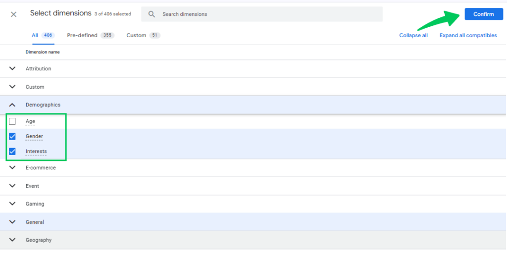
To add a dimension to GA4’s Free-Form Exploration:- Navigate to the Variables section.
- Click the Plus (+) icon next to Dimensions.
- Select the dimension that aligns with your analysis needs, such as User Type, Traffic Source, or Conversion Event.
- Once selected, click on the confirm tab to add it to your report.
For example, adding a dimension like User Type (New vs. Returning users) lets you see how different groups behave on your site. In contrast, a dimension like Traffic Source lets you understand which channels drive visitors.
- Modifying Dimensions
You can also modify dimensions by adjusting their settings or applying filters:- After adding a dimension, you can modify it by applying filters in the Tab Settings section to focus on specific user actions, locations, or device types.
- You can drag dimensions into the Rows or Columns section to modify how they are displayed. For example, you could place a Conversion Event in the Rows section to display a list of different conversions alongside performance metrics.
By carefully selecting and modifying dimensions like user behavior, traffic sources, and conversions, you can create detailed, customized reports that reveal information into how users interact with your site and how different campaigns and channels contribute to your goals.
Using Analytify for Custom Reports in WordPress Dashboard
Analytify stands out as one of the best plugins for integrating GA4 data directly into the WordPress dashboard. It offers a user-friendly interface that simplifies complex analytics. Its ability to present GA4 reports in an intuitive manner makes it easy for businesses to understand their data seamlessly without leaving their site.
Join 50,000+ beginners & professionals who use Analytify to simplify their Google Analytics!
This best WordPress Analytics plugin simplifies the process of building custom reports, offering clear and visually appealing presentations of key metrics such as traffic sources, user demographics, and real-time activity. Customizable reporting filters and visual charts help you focus on specific user interactions and behavior, facilitating adjustments to content, marketing, and overall site strategy—all directly from the WordPress dashboard.
Below are the key features that help streamline your reporting process:
- Key Metrics displayed directly on the dashboard:
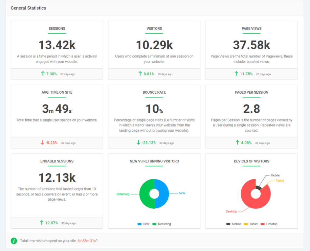
Analytify’s intuitive dashboard consolidates essential metrics like sessions, page views, and bounce rates, making reviewing your site’s overall performance easier.
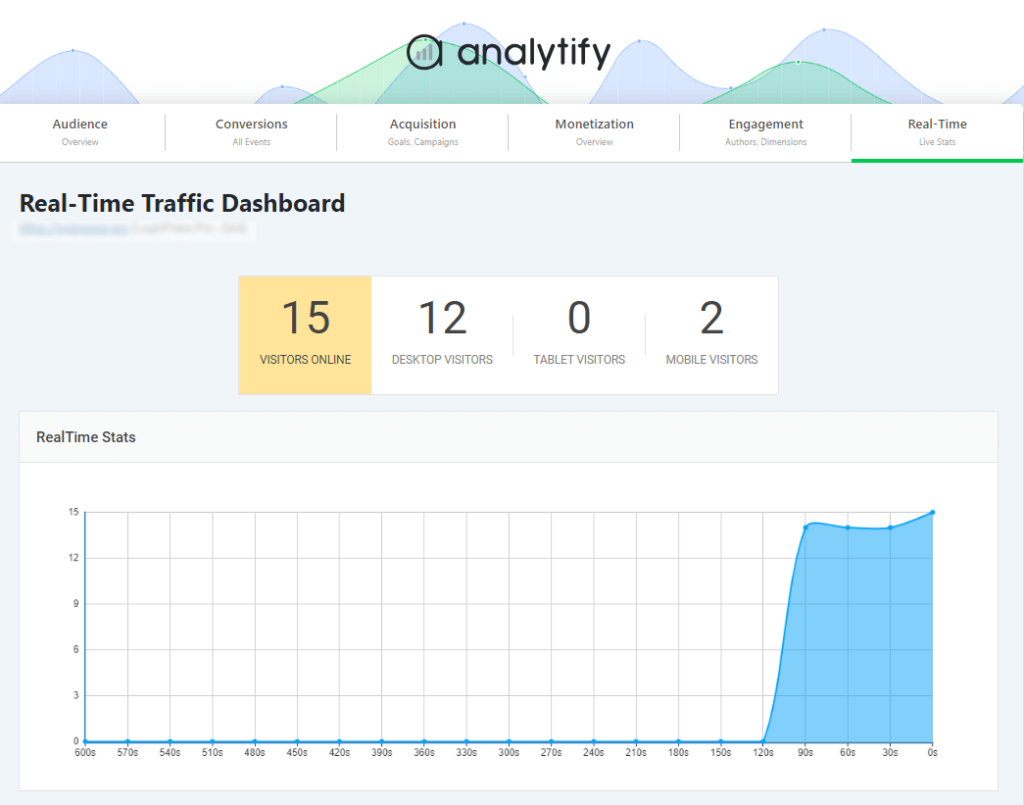
- Real-time Report
The real-time reporting feature provides live data on user activity. Whether monitoring a campaign or making immediate changes to your site, Analytify lets you see the impact in real-time.
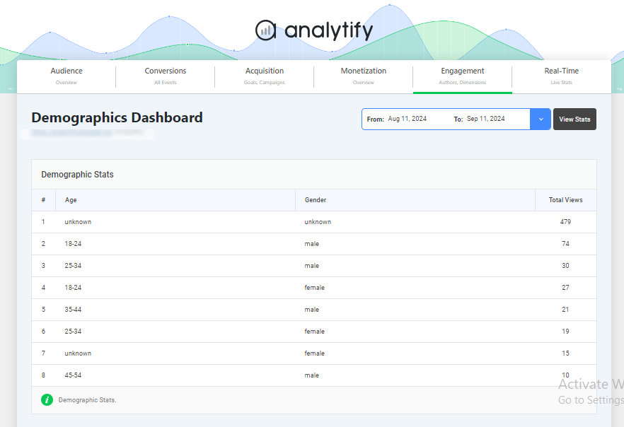
- Demographic and Interest Reports
Get details of your audience with Analytify’s demographic reports. This data is presented clearly and directly in the dashboard without manually setting up Google Signals in GA4.
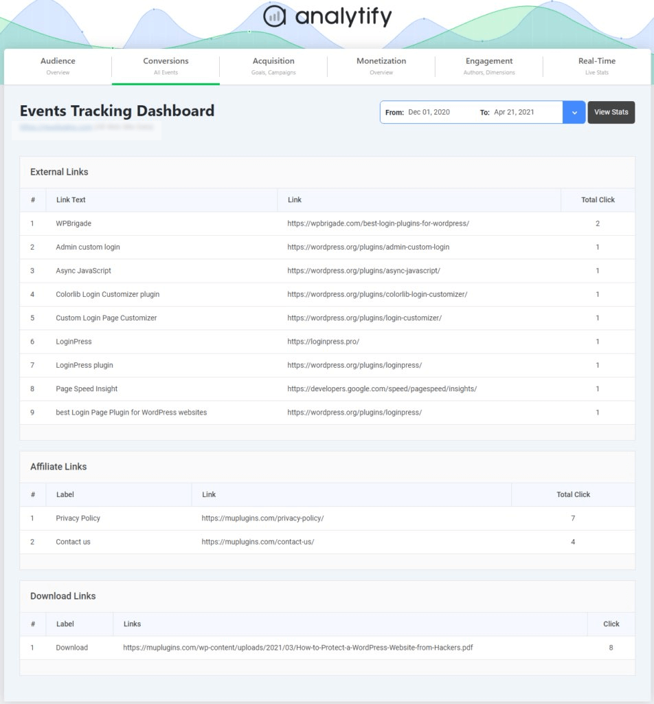
- Event Tracking
The Analytify Event Tracking add-on makes setting up and monitoring events straightforward. You can track essential user interactions like form submissions, downloads, and button clicks without diving into GA4’s complex event setup.
- Goal Tracking
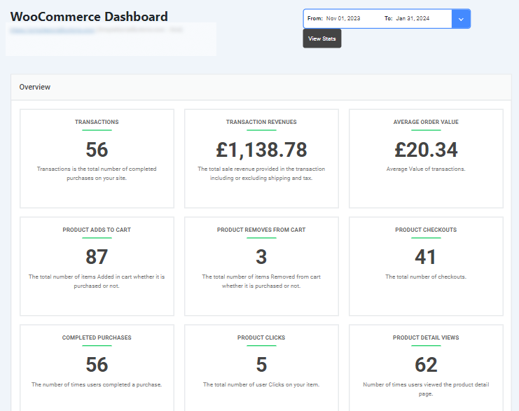
Easily set and track goals in Analytify with Goal Tracking add-on, ensuring that all key conversion actions (e.g., purchases, sign-ups) are monitored and reported. This feature helps verify your goals are correctly configured for accurate reporting. - Ecommerce Tracking
For e-commerce websites, the WooCommerce add-on provides seamless integration, allowing you to track revenue, product performance, and transactions effortlessly. Analytify displays these metrics clearly.
- Email Notification Addon
Stay informed with real-time updates via email notifications on your website’s performance due to the Email notification add-on. This feature keeps you updated on critical metrics without constantly logging in. - UTM Campaign Tracking
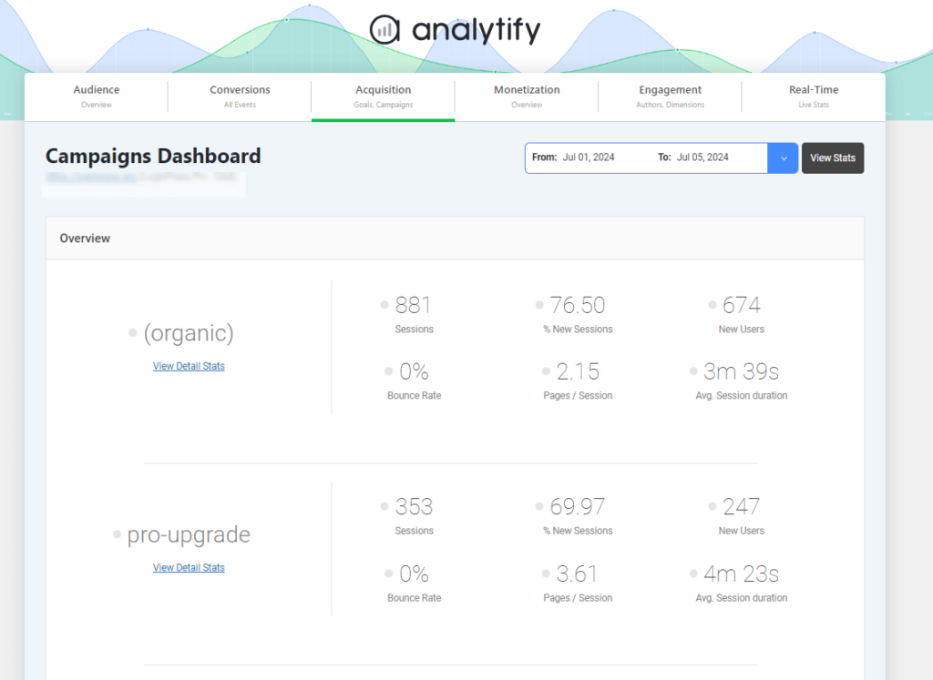
Analytify supports UTM campaign tracking, making it easy to see how your marketing efforts are performing. It tracks the success of various campaigns.
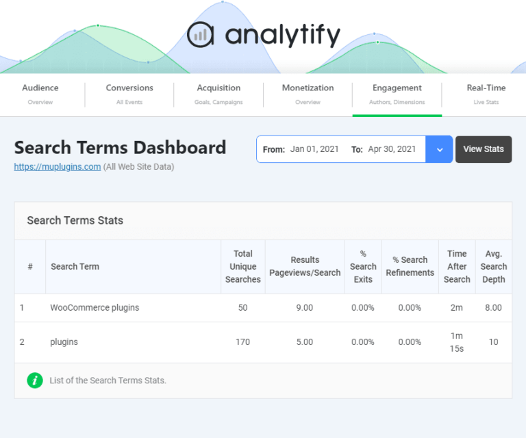
- Search Term Dashboard
Analytify captures internal search queries users enter and displays them in a search term dashboard. This valuable data helps identify what visitors are looking for on your site.
Analytify simplifies monitoring Google Analytics data using these features, allowing users to focus on useful information and data accuracy.
Best Practices for Building Actionable Reports
- Focus on Key Performance Indicators (KPIs): Prioritize metrics that reflect your business’s core objectives. Aligning KPIs with goals provides clarity and keeps reports relevant.
- Choose KPIs That Align with Business Goals: Select KPIs that directly support your business’s strategic priorities, ensuring your reports offer actionable insights rather than just numbers.
- Combine Multiple Reports for Holistic Analysis: Integrate data from various reports to create a well-rounded perspective, which helps you understand the full context of performance across different metrics.
- Save, Share, and Automate Custom Reports:
- How to Save and Reuse Custom Report Templates: Save templates for commonly used reports, allowing for faster, consistent report creation. These templates ensure that key metrics are always included and formatted correctly.
- Simplify Report Creation with Saved Templates: Use pre-made templates to streamline report generation, making maintaining quality and consistency across regular reports easy.
- Automate Reports for Regular Updates:
- Setting up Automated Report Emails for Your Team: Schedule reports to be automatically emailed to team members at regular intervals. This will keep everyone updated without manually generating reports each time.
Following these practices helps make reports actionable, consistent, and readily accessible for your team.
Google Analytics Custom Reports FAQs
1. How many custom reports can I create in Google Analytics?
In Google Analytics, you can create up to 100 custom reports per view, allowing flexibility to tailor reports to your needs.
2. What would prevent data from appearing in a custom report in Google Analytics?
Data might not appear in a custom report if the selected metrics and dimensions are incompatible, filters are overly restrictive, or insufficient data for the chosen criteria.
3. Does Google Analytics report in real-time?
Real-time reports show events and usage data for periods ranging from the present moment to 30 minutes ago (up to 60 minutes for Google Analytics 360 properties). They can be used for applications like live visitor counters on your website.
4. Can you share custom reports in Google Analytics?
To share one of your custom reports, open the Customization section of your account, click on the Actions button for the report, and select Share. A modal window will open where you can choose “Share template link.” Click the “Share” button to get a URL to share.
5. What is the purpose of a custom report in Google Analytics?
A custom report in Google Analytics provides tailored details by displaying specific metrics and dimensions relevant to your business goals, enabling focused analysis.
Wrapping up!
In conclusion, custom reports in Google Analytics 4 (GA4) empower you to gain deeper details tailored to your business needs. Unlike standard reports, custom reports enable you to focus on specific metrics and dimensions, streamline your analysis, and make decisions more precisely.
Using GA4’s Free-Form, Path, and Funnel Explorations, you can visualize user behavior, track conversions, and identify key performance indicators that matter most to your objectives. With the flexibility to personalize filters, segment comparisons, and data visualizations, custom reports in GA4 are important for any strategy.
Analytify further enhances this experience by simplifying GA4’s custom reports, making tracking and interpreting user journeys easier. To Learn about each report in detail, visit these Funnel Exploration Reports and Path Exploration Reports guides.
Let us know your thoughts! Leave a comment below if you’ve tried GA4 custom reports for detailed tracking.


