How to Use Plot Rows in Google Analytics 4 (2025 Update)
Did you hear about the new feature of plot rows in Google Analytics 4?
GA4 Plot Rows feature allows you to plot multiple metrics on separate rows within the same chart. This means you can compare and contrast different data points side-by-side, making it easier to spot trends, patterns, and correlations. No more juggling multiple charts or getting confused with overlapping lines. Plot rows bring clarity and simplicity to your data visualization.
In this new guide, we’ll discuss plot rows in Google Analytics 4 in detail. We’ll explore what they are, how to access and enable them, how to add and customize metrics, and, most importantly, how to use them to analyze your data effectively.
GA4 Plot Rows (TOC):
What are Plot Rows in Google Analytics 4?
GA4 Plot Rows lets you display multiple metrics on the same chart, but this is the cool part, as each metric gets its very own row. No more squinting at overlapping lines or trying to decipher which color represents what. With Plot Rows, everything is neatly organized and easy to compare. It’s like giving each metric its own little spotlight on the stage.
So, what does this mean for you? Well, imagine you want to see how your website traffic and conversions trend over time. Instead of creating three separate line charts, you can now plot all three metrics on a single chart using Plot Rows. This not only saves you time but also makes it way easier to spot correlations and trends between different metrics.
Why Use Plot Rows in GA4?
Plot Rows feature for line charts in GA4 offer several benefits that make them a useful feature:
- Better Trend Analysis: By plotting specific GA4 plot rows in line charts from a detailed report, you can isolate and examine the trends of individual dimensions or metrics over time. This allows for a more focused analysis than looking at aggregated data.
- Enhanced Comparative Visualization: You can plot multiple rows simultaneously on the same chart, enabling direct visual comparison of their performance and trends. This facilitates the identification of correlations, discrepancies, and patterns between different data points.
- Improved Data Granularity: Instead of relying solely on overall trends, you can see specific segments or components of your data. This reveals insights that might be hidden in the aggregated view.
- Identifying the Driving Forces Behind Overall Trends. For example, if you see a spike in traffic, you can use plot rows to quickly see which specific channels or sources contributed to that spike.
Accessing and Enabling Plot Rows in GA4
Alright, now that you know what Plot Rows are, let’s get them up and running in your GA4 account. Don’t worry, it’s easy!
Here’s how to access plot rows in Google Analytics:
- Head to your GA4 Reports: Log in to your Google Analytics 4 account and navigate to the “Reports” section.
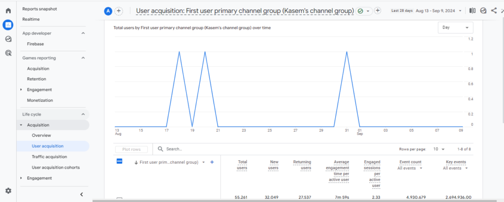
- Navigate to any Report: Open any detail report in GA4 where you have a table of data and a corresponding line chart.
You’ll typically find these in reports like “Acquisition Overview,” “User Acquisition,” or any custom report you’ve created with a line chart.
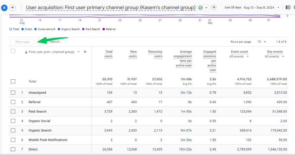
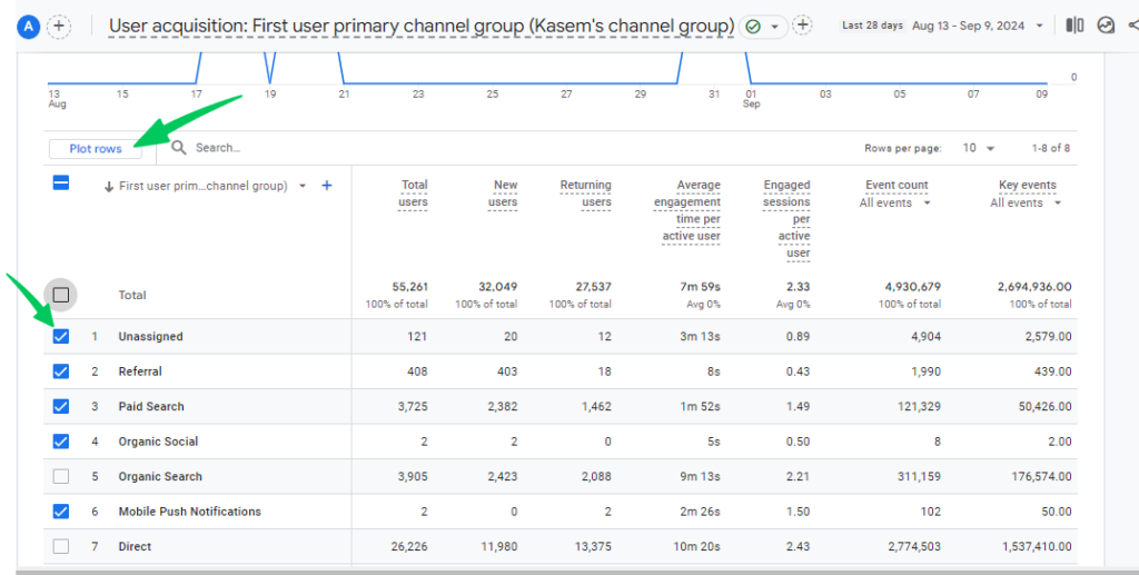
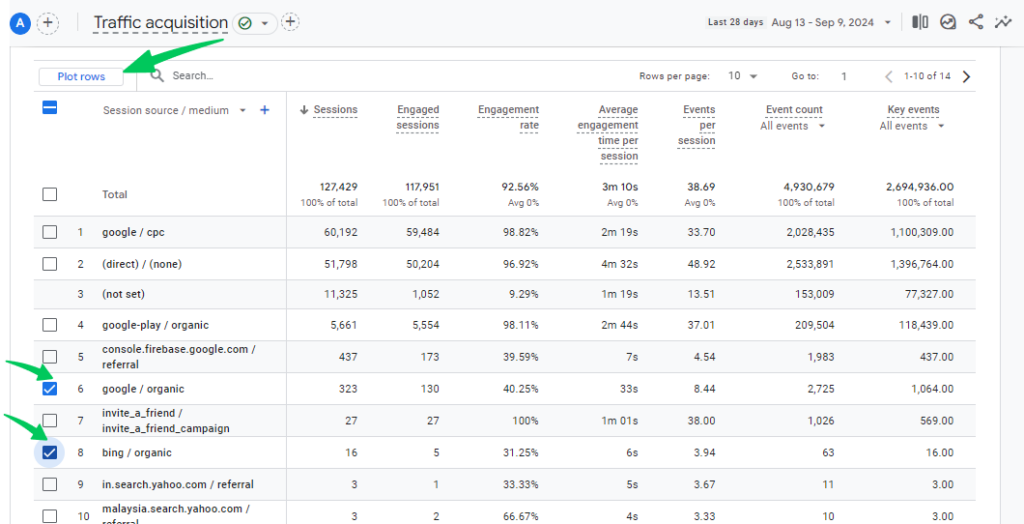
- Select Rows: In the data table, select the “Total” row or up to 5 individual rows that you want to plot on the chart.
- Click “Plot Rows”: Look for the “Plot rows” option at the top of the table and click on it.
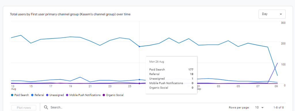
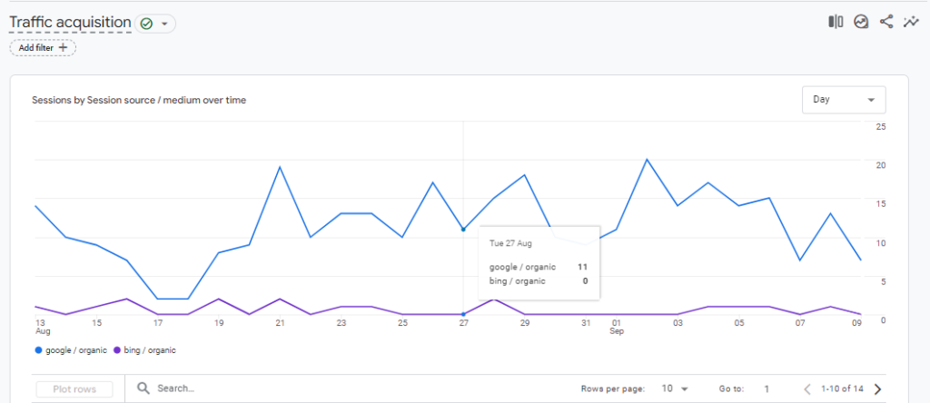
- View the Chart: The line chart will update to display only the selected rows, allowing you to focus on specific trends and comparisons.
Key Points:
- You can plot the Total rows and a maximum of 5 individual rows at a time.
- This feature is particularly useful for comparing specific dimensions or metrics over time without the clutter of other data.
- The “Plot Rows” functionality enhances the flexibility and customization of data visualization in GA4, enabling users to gain deeper insights into specific aspects of their data.
Remember: The availability of the “Plot Rows” feature may depend on your GA4 account and the specific report you are viewing. If you don’t see the option, it might not be supported in that context yet.
How Plot Rows Can Be Used to Analyze Website Traffic Patterns
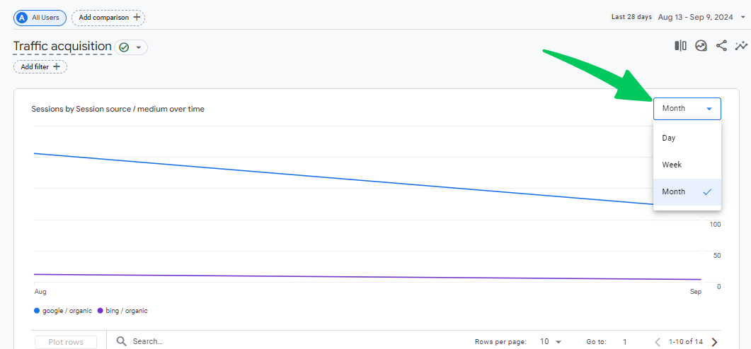
Suppose you want to compare the performance of organic search traffic from Google vs. Bing over the last month in Google Analytics charts.
Steps:
- Access the Traffic Acquisition Report: Navigate to Reports>>Acquisition>>Traffic acquisition in GA4.
- Adjust the Date Range: Set the date range to the past month.
- Identify Relevant Rows: In the data table, locate and select the rows for:
- google / organic
- bing / organic
- Plot the Rows: Click the “Plot rows” button at the top of the table.
- Analyze the Chart: The line chart will now display three lines:
- One for the total traffic
- One for “google / organic” traffic
- One for “bing / organic” traffic
You can visually compare their trends over the month, observing:
- Which search engine drove more traffic overall.
- If there were any significant fluctuations or spikes for either source.
- The relative contribution of each search engine to your total traffic.
Additional Tips:
- You can hover over the chart to see the exact values for each source at specific points in time.
- You can further customize the chart by adding comparisons (e.g., compare to the previous month) or applying segments.
- Consider plotting other relevant dimensions, such as “Session medium” (to compare organic vs. paid traffic) or “Session campaign” (to evaluate the performance of specific campaigns).
Remember: Plot Rows is a powerful tool for isolating and comparing specific trends within your traffic acquisition data, helping you gain deeper insights into your marketing efforts.
Bonus for WordPress Users: Simplify GA4 with Analytify
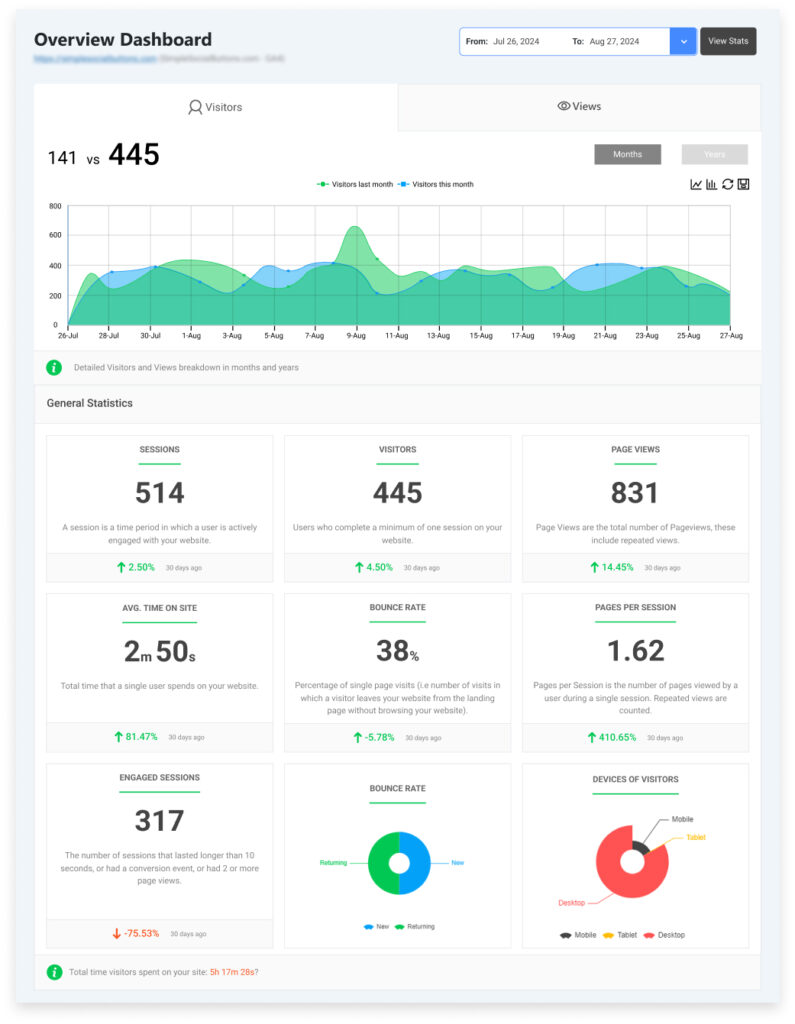
If you’re a WordPress user using the best Google Analytics plugin to integrate GA4 with your site, you have several options to access and analyze your GA4 data right from your WordPress site.
Join 50,000+ beginners & professionals who use Analytify to simplify their Google Analytics!
- Analytify Dashboard: Analytify creates a dedicated dashboard within your WordPress admin area. Here, you can access various pre-built GA4 reports.
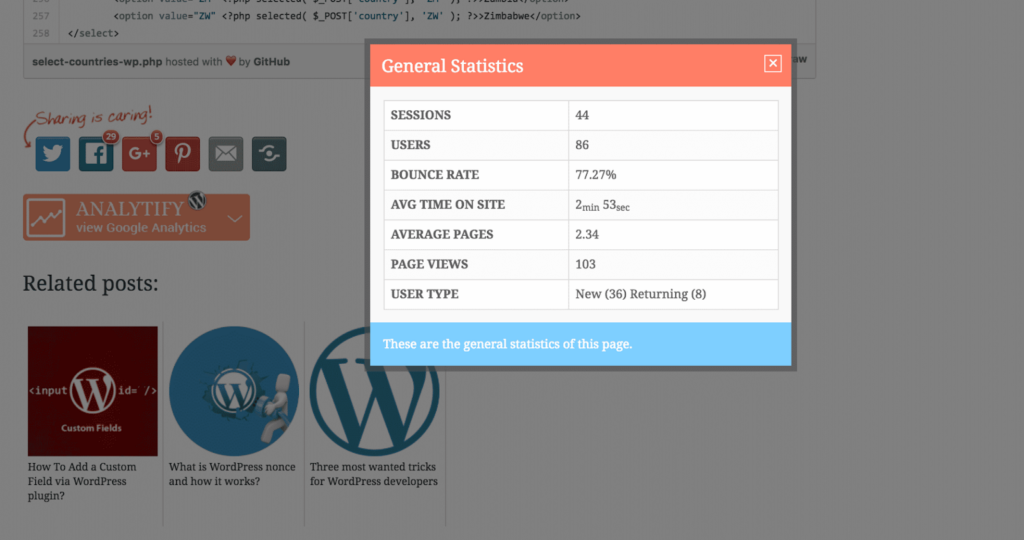
- Frontend Reports: Analytify also allows you to embed GA4 reports directly on your frontend WordPress pages or posts using shortcodes or Gutenberg blocks. This gives you and your team (or even your clients if you’re an agency) the ability to view GA4 data without leaving your WordPress environment.
GA4 Plot Rows (FAQ)
1. How to plot rows in Google Analytics?
In GA4, navigate to a detailed report with a table and line chart.
Select the “Total” row and up to five individual rows in the table.
Click the “Plot rows” button at the top of the table.
The line chart will update to display only the selected rows, allowing you to focus on specific trends and comparisons.
2. What do plot rows mean?
Plot rows is a feature in GA4 that lets you visualize specific rows from a data table directly onto a line chart. It isolates the data you want to see, helping you focus on specific trends and comparisons.
3. How do I track leads in Google Analytics 4?
Identify lead actions: Determine what actions on your website indicate a lead (e.g., form submission, download, signup).
Mark events as conversions:
If these actions are already tracked as events, go to “Conversions” in GA4 and mark the relevant events as conversions.
4. What is the other row in GA4?
In some GA4 reports, you might see an “Other” row. This row aggregates data for dimensions with low occurrences or falling below a certain threshold. It helps keep reports clean and focused on the most significant data.
5. How to change the graph in GA4?
You can customize visualizations in GA4 reports and explorations in a few ways:
Change chart type: In some reports, you might be able to switch between line charts, bar charts, pie charts, etc.
Add/remove metrics and dimensions: Choose which data points you want to display on the axes.
Apply filters and segments: Focus on specific subsets of your data.
Use explorations: Create custom visualizations and analyses with more flexibility.
Final Thoughts: GA4 Plot Rows
In this article, we covered the new feature of plot rows in GA4. We’ve covered everything from the basics to how to use plot rows in GA4.
Key Takeaways:
- Plot Rows allow you to display multiple metrics on separate rows within the same GA4 line chart.
- They enhance clarity and make it easier to compare different metrics simultaneously.
- You can access and enable Plot Rows through the chart editor’s “Setup” tab.
- Add relevant metrics to each plot row and customize their appearance for better visualization.
- Use Plot Rows to identify trends, patterns, and correlations in your data.
- Follow best practices to ensure your charts are informative and easy to understand.
We hope this article helped you understand Plot Rows in Google Analytics 4.
You may also like to read about How to Create a GA4 Landing Page Report.
Now, we want to know which GA4 report you want to use plot rows for. Please let us know in the comment box so that we can discuss it further.

